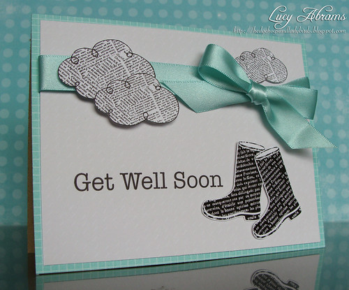
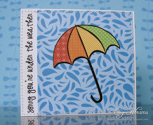
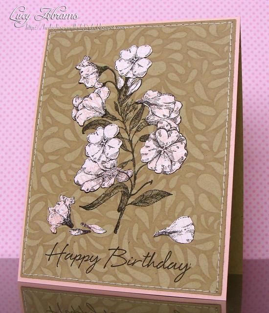
OK. So a few weeks ago I shared some publications. This week I thought I'd share some cards that didn't make the cut.
When I first started submitting for magazines, I found it really hard getting rejected. And believe me, I must have submitted hundreds of cards before I got one selected. Now, I consider rejection just a part of the process. And there could be any number of reasons why a card is not chosen. I do like to look back at the rejects and consider what was not quite right, so I thought that with each rejected card I post this week, I'd try a little analysis of why I think it wasn't chosen. And I am NOT doing this to gain sympathy :), I just want to encourage you to submit, and maybe my analysing a little might help YOU. Because getting a card chosen for publication is one of the best feelings EVER. :)
So here goes...
For today, a card I made for a CARDS magazine call. The call was for a red, yellow and teal school themed card. Here's my attempt...
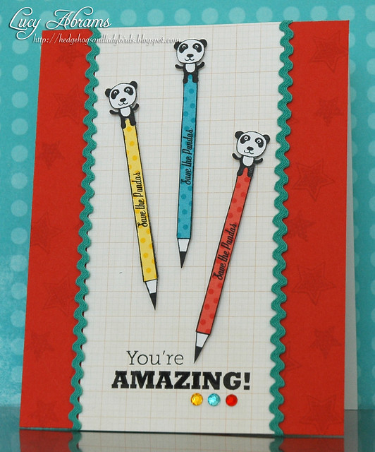
Looking at it now, I think perhaps it was too symmetrical and flat for CARDS. They publish a lot of shabby, vintagey cards - cards with loads of texture... cards I aspire to make :) Maybe this was just too one dimensional - not enough ribbon, not enough bling.
Buy hey - I still like it. :) And that panda pencil is one of my all time favourite EVER stamps so I had to try.
I hope this is helpful in some way to those of you who are trying to get published for the first time. My advice, don't give up. It'll happen eventually. It took me over a year and I often felt like giving up trying. Glad I didn't now. :)
I hope this is helpful in some way to those of you who are trying to get published for the first time. My advice, don't give up. It'll happen eventually. It took me over a year and I often felt like giving up trying. Glad I didn't now. :)
Back soon with another reject.

